July 27, 2026
Before printing, on the press
Before printing, on the press
How a pair of scissors decided the shape of the Human series — and why I have trusted form ever since.
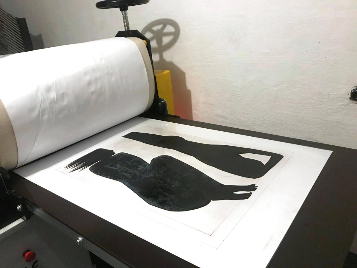
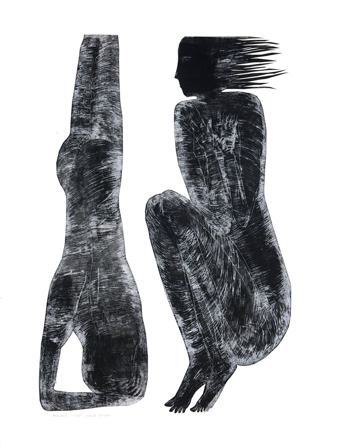
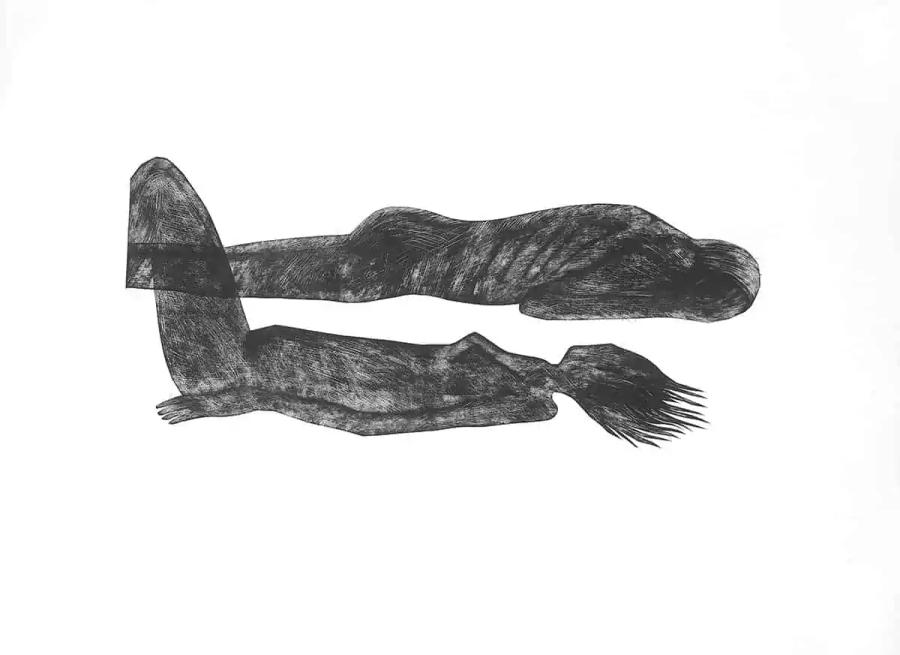
The series of prints I made in 1998 is called Human. A single word that means so much, and it is the thread running through every image in the group. Each print carries its own title. The title of the series is what holds them together.
Some time has passed since they were made. And still I keep returning to them, because people who love art — and who love my art — keep asking for them.
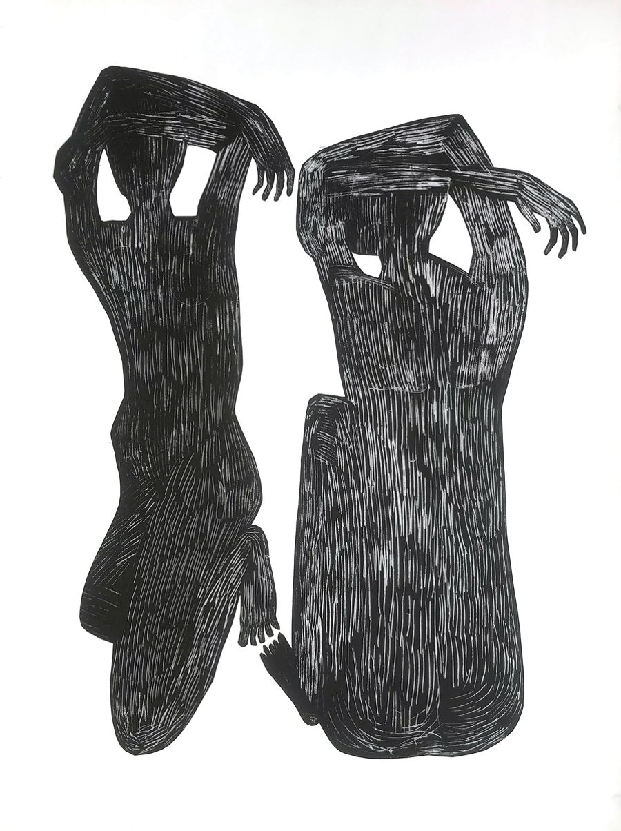
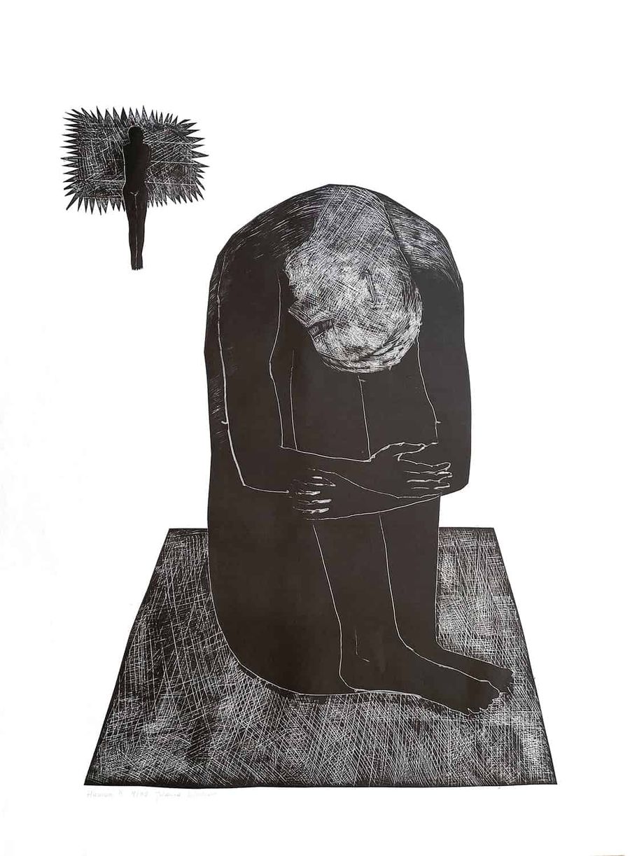
The prints are simple. Two black figures on a white ground. Their simplified silhouettes, the poses they take, and where they lie in relation to one another: those are the visual means I use, and there are no others.
Can anything be said with a bent knee, an outstretched arm, a hidden head, a face barely marked? I ask because, as a visual artist, these are the only tools I have — shape, form and colour, on a flat surface. For Human I gave up colour altogether. I narrowed my possibilities as far as they would go. Intuition told me to.
At first I wanted to place my figures somewhere. In a scene, in a setting. I tried to draw all of it inside a single matrix, and the results did not satisfy me. And then came the moment that ought to arrive in every creative process — I believe that it must — the decision to do something you had not planned, something whose consequences you cannot yet know. A jump into deep water.
In this series, it was the decision to pick up a pair of scissors.
I took them in my hand and began to cut away the parts of the matrix I had worked on so carefully. They fell off like something useless. And from under the blades my figures emerged.
I should add that the cutting was not automatic. I followed the blades closely. Every turn, every notch was preceded by a decision — conscious and unconscious at the same time. Intuitive.
That is how the matrices for this series came into being. The human figures in these prints already carry the qualities that appear in all my later figurative work. My people from 1998 showed me the power of form. Since then I have been certain of one thing.
Form is the architecture of every work.
Paul Cézanne discovered this, and his art went on to change the whole course of modern painting. Art is so capacious, so universal, that this architecture — an image built through form — can be constructed in countless ways. When I look at paintings, I am always looking for it. And I find it even in the misty landscapes of Joseph Turner.
The Space Between
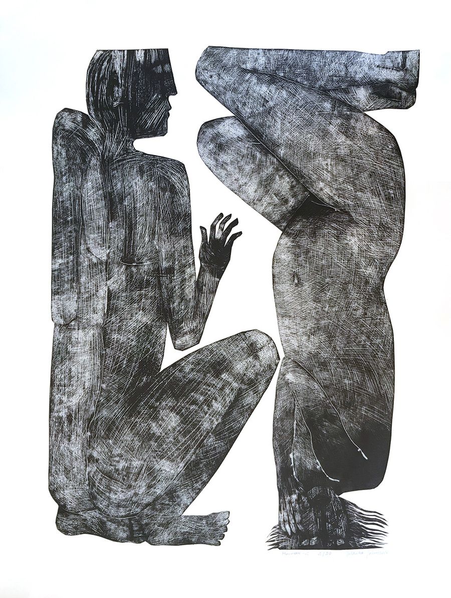
The Space Between is the print from Human that lives in the most collections. Two figures meet at the centre of the gaze and hold there — posture against posture, in a tension that never quite resolves. It is a confrontation, and it is also a conversation: the kind that happens when two ways of seeing collide and quietly change each other.
I almost never work toward a likeness. The human figure, for me, is a vehicle for something existential. A man and a woman, opposing and connected, standing for the larger truth that contrast does not divide us — it sharpens us. Step closer and the meaning moves toward whatever you have lived through. That openness is deliberate. I would rather leave the question with you than answer it for you.
A figurative graphic work, 70 × 50 cm, in a limited edition of thirty. Each sheet signed by hand, and there will never be a thirty‑first. I pack every print myself.
So I will ask you the question I have been carrying since 1998: do you think it speaks differently from the others in the series? I read every reply.
Studio Letters
A letter from the studio, once a month.
The stories behind the work — and the first look at new pieces, before they go anywhere else. Written from Boxholm, to one person, not to a list.
No noise, no selling. One letter a month, and you can step away any time.
— Jolanta
Featured In This Article
Artworks
Continue Reading
More From the Studio
Oct 20
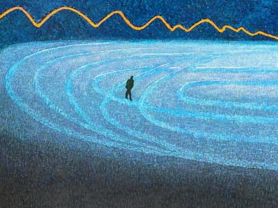
Free Man on a Curve
A song by Agnieszka Osiecka speaks of standing on a curve, where even the sky looks tilted. Every life has such moments. In Free Man on a Curve, a small figure stands where many roads branch off. He is free to choose, yet only from what he has been given, while the mountains watch in silence.
Sep 19
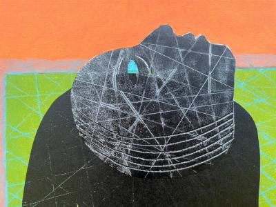
For years I titled my paintings the way you'd label a box: "Woman Sitting," "Landscape, Autumn." Then a gallerist told me, plainly, that I needed to do better — and sent me looking at Monet, Cézanne and the Dadaists to understand why a title is never just a label.
Sep 5
Can Color be a shelter?
A painting built from one question: can a colour become a place to hide inside? Jolanta Johnsson on making Pink as Shelter, the politics of pink, and the figure who chose the colour and made it her own.
Interested in Jolanta's work? Browse the gallery or get in touch.